Dynamic dimensions in Power BI
Create a dynamic bar chart axis in Power BI
In this tutorial, we’ll create a bar chart with a dynamic axis based on a slicer selection. It’s a feature that is not supported out of the bow but with a little workaround and some DAX functions you can easily extend the Power BI functionality.
A live demo of the end result you can find here: https://app.powerbi.com/view?r=eyJrIjoiYzM2MDkyNTQtMzQ1Yi00OGU1LTk4OGItYjU5NmExZjQ5NmEzIiwidCI6ImU5MzE1MmZmLTUxYTAtNGE2Ni1iNmRlLTYzNWJmMGE3ZjBkNSIsImMiOjh9
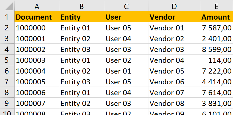
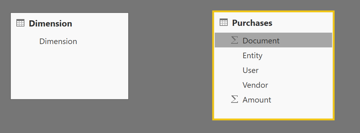
In our example we’ll use a simple purchasing dataset. The purchasing table contains the document number, the legal entity for which the purchase was registered, the user that entered the purchase, the vendor and the amount. We want to be able to have a dynamic axis that allows us to see the data either by entity, user or vendor.
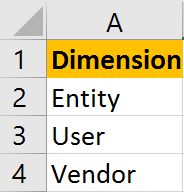
To have a slicer that allows us to select the dimension we want to display in our graph we need to manually create a new table that lists those dimensions.
At this point starts the tricky part. Let’s load the data and see how far we can get.
In Power BI we now have our two tables loaded without any relationship between them.
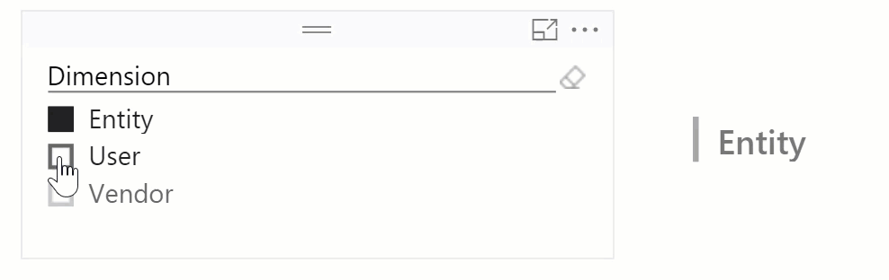
Start by creating a slicer for the dimension.
To demonstrate why we will need to apply a few tweaks in the following steps, create both a column and a measure in the purchases table that holds our dimension selection. We can fetch the selection using the FIRSTNONBLANK() function. The first element of the function is the reference to our dimension column. The second element is the non-blank evaluation. No evaluation is needed here so set the value to 1 so that it will always return a value.
The formula for the column is:
DimensionColumn = FIRSTNONBLANK('Dimension'[Dimension];1)
And for the measure:
DimensionMeasure = FIRSTNONBLANK('Dimension'[Dimension];1)
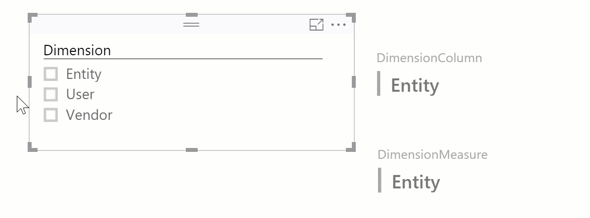
Now create a multi-row card for the DimensionColumn and a second multi-row card for the DimensionMeasure so we can display the values.
Select the different dimensions from the slicer and notice the difference in behavior between the measure and the column. In an unrelated table, we can perfectly fetch a selection from another table for a measure. It would allow us to create dynamic measure. So, displaying a different value depending on the selection made in the slicer. E.g. switch between the total amount and average amount. For more information on dynamic measures check out this blog post: http://breaking-bi.blogspot.be/2016/06/power-bipowerpivot-using-slicers-to.html
However, the value of the column remains the same. Because the tables are unrelated Power BI does not carry over the dimension filter we placed using the slicer. Even though we used the same formula as in the measure. But, to make our column dynamic we need access to the selected dimension. We want to be able to say that if the selected value of our slicer is ‘Entity’ then take the purchase entity column for our axis and so on. To achieve that we need to create a relation between the dimension table and the purchases table.
But wait, which two fields can we connect between dimensions and purchases? Right, none. To do that we will need to create an artificial join table. This join table will have the combination of the unique identifier of the purchases table, here the document, and the unique identifier of the dimension table, here the dimension.
Making the combination is like multiplying matrices. Our demo dataset holds 232 purchases and 3 dimension. The join table will have 232 X 3 = 696 records. The structure of the join table looks like this:
Document 	Dimension
1000000 	Entity
1000001 	Entity
   ⋮ 		   ⋮
1000000 	User
1000001 	User
   ⋮ 		   ⋮
1000000 	Vendor
1000001 	Vendor
   ⋮ 		   ⋮
Now add this join table to our model. Upon loading Power BI automatically created relationships between the three tables based on the column names. If not make the required changes in the model.
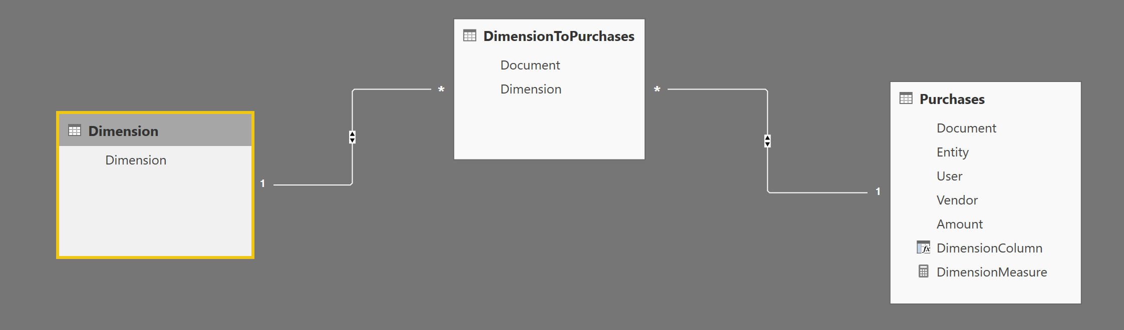
One thing to verify is that ‘cross filter direction’ is set to ‘both’ for the two relationships.
Let’s return to our report and see the changes. Oh, no nothing happened. We still don’t get the value of the selected dimension in our purchases table. But we can retrieve the value in our join table. Create the same DimensionColumn in the dimensionToPurchases table.
DimensionColumn = FIRSTNONBLANK('Dimension'[Dimension];1)
When we now change the dimension, we can see the value of the DimensionColumn changing as well. Great this is the basis we need to create a dynamic column. We’ll use the SWITCH() function to select the correct dimension values, i.e. the column in our purchases table, based on the selected dimension. The SWICTH() function is a more compact way of creating an IF … THEN … ELSE … function. Change the formulate to the following:
DimensionColumn = SWITCH(FIRSTNONBLANK(Dimension[Dimension];1)
			;"Entity"; RELATED(Purchases[Entity])
			;"User"; RELATED(Purchases[User])
			;"Vendor"; RELATED(Purchases[Vendor])
			)
The next thing we need is to pull in the sum of the purchases. Create a new measure in the DimensionToPurchases table.
TotalPurchases = SUM(Purchases[Amount])
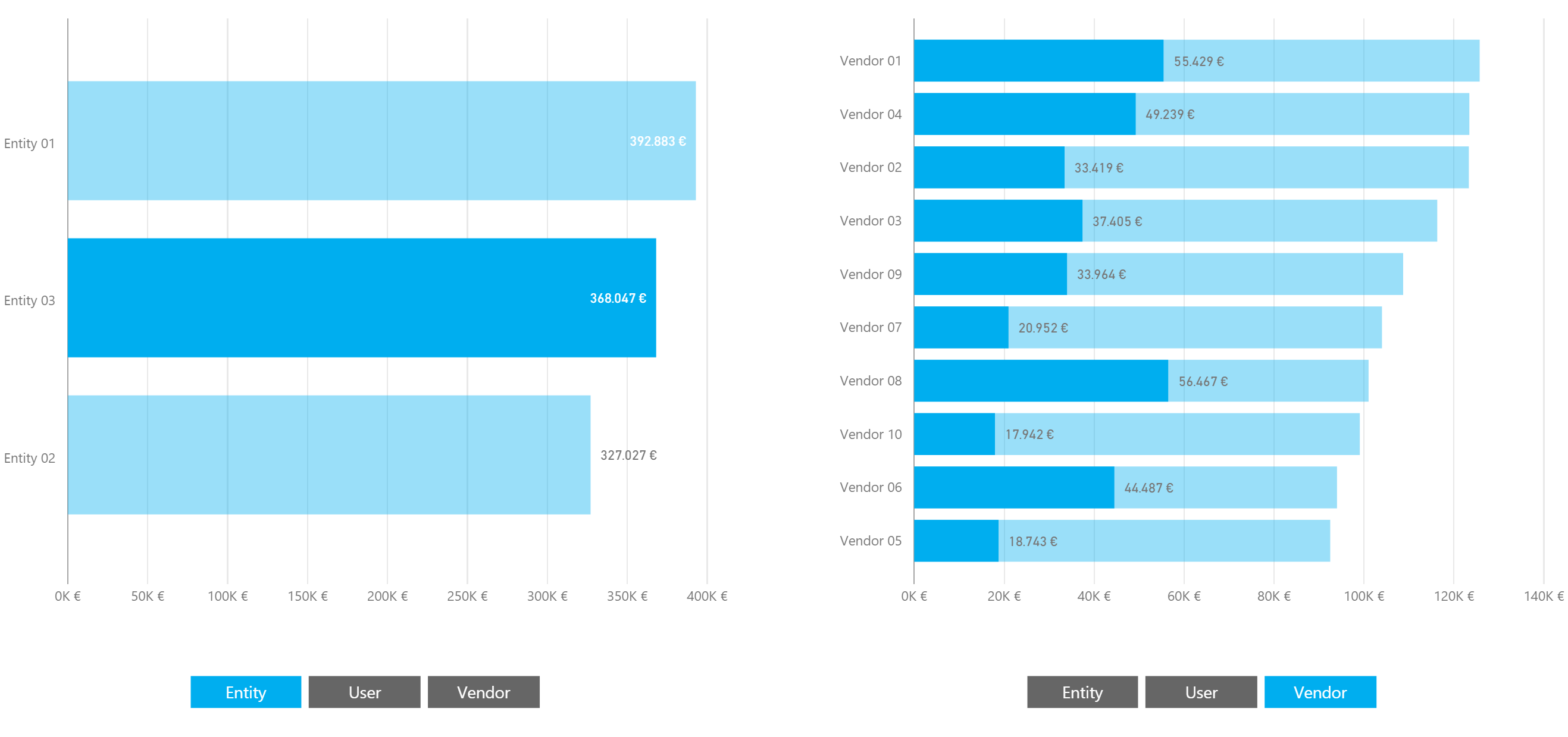
Create a new bar chart with the DimensionColumn as the axis and TotalPurchases as the value. You should end up with something like this:
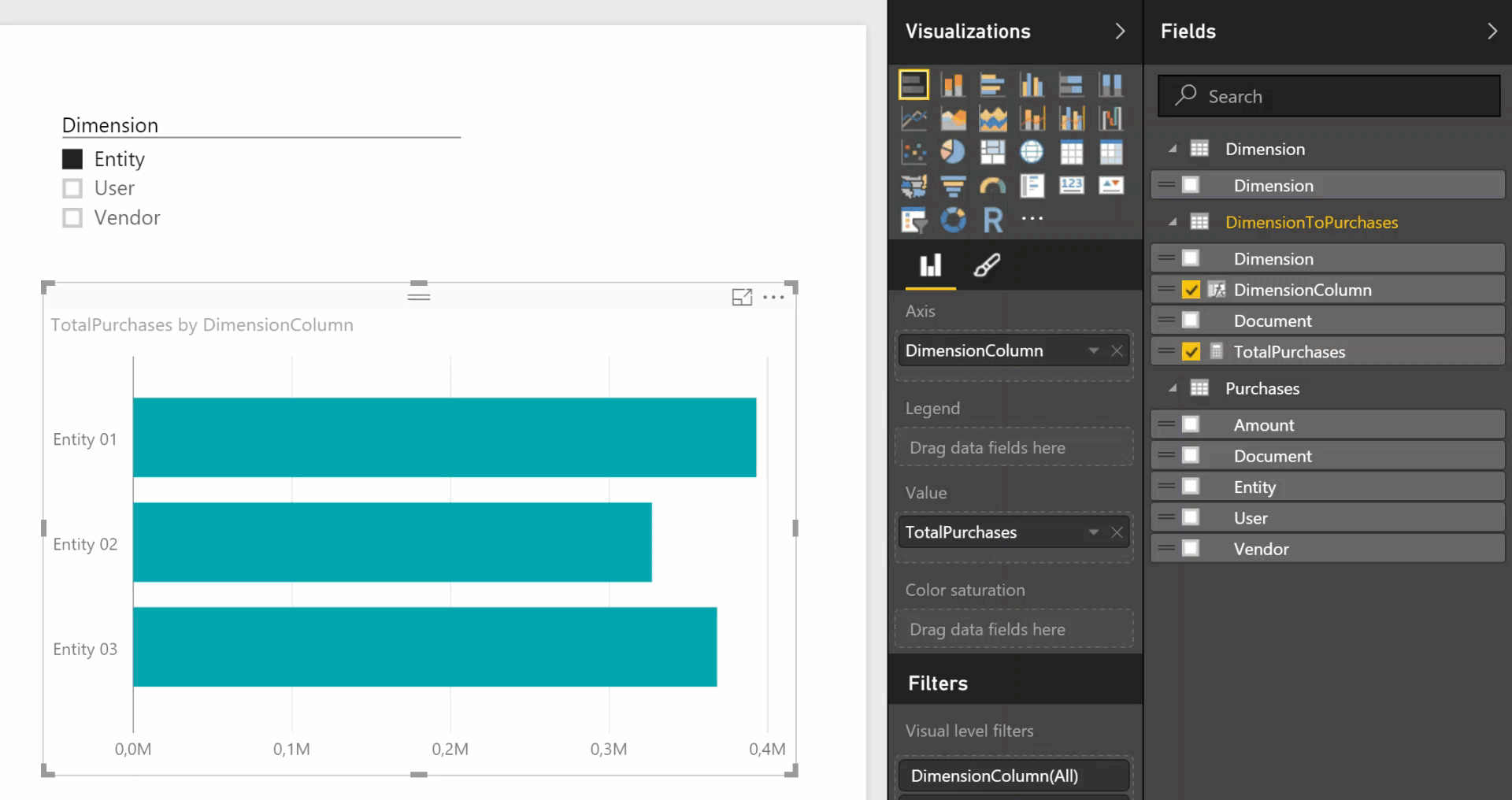
Cool, we now have what we want. A bar chart with a dynamic axis. Before we go out and celebrate, let’s make a few additional improvements to our report.
Instead of using the out of the box slicer we’ll use the chiclet slicer. The chiclet slicer allows us to enforce a selection of the dimension, and gives some extra styling options as a bonus. You can download the chiclet slicer for free from the Power BI visuals galley https://app.powerbi.com/visuals/.
To make sure that always one dimension is selected, and that only one can be selected open the general settings tab and set ‘multiple selections’ to ‘off’ and ‘forced selection’ to ‘on’.
To improve the look and feel the following properties were update in the Chiclets tab of the slicer settings:
- Selected Color set to the theme green
- Unselected Color set to dark grey
- Outline Weight set to zero
- Text Color set to white
- Outline Style set to square
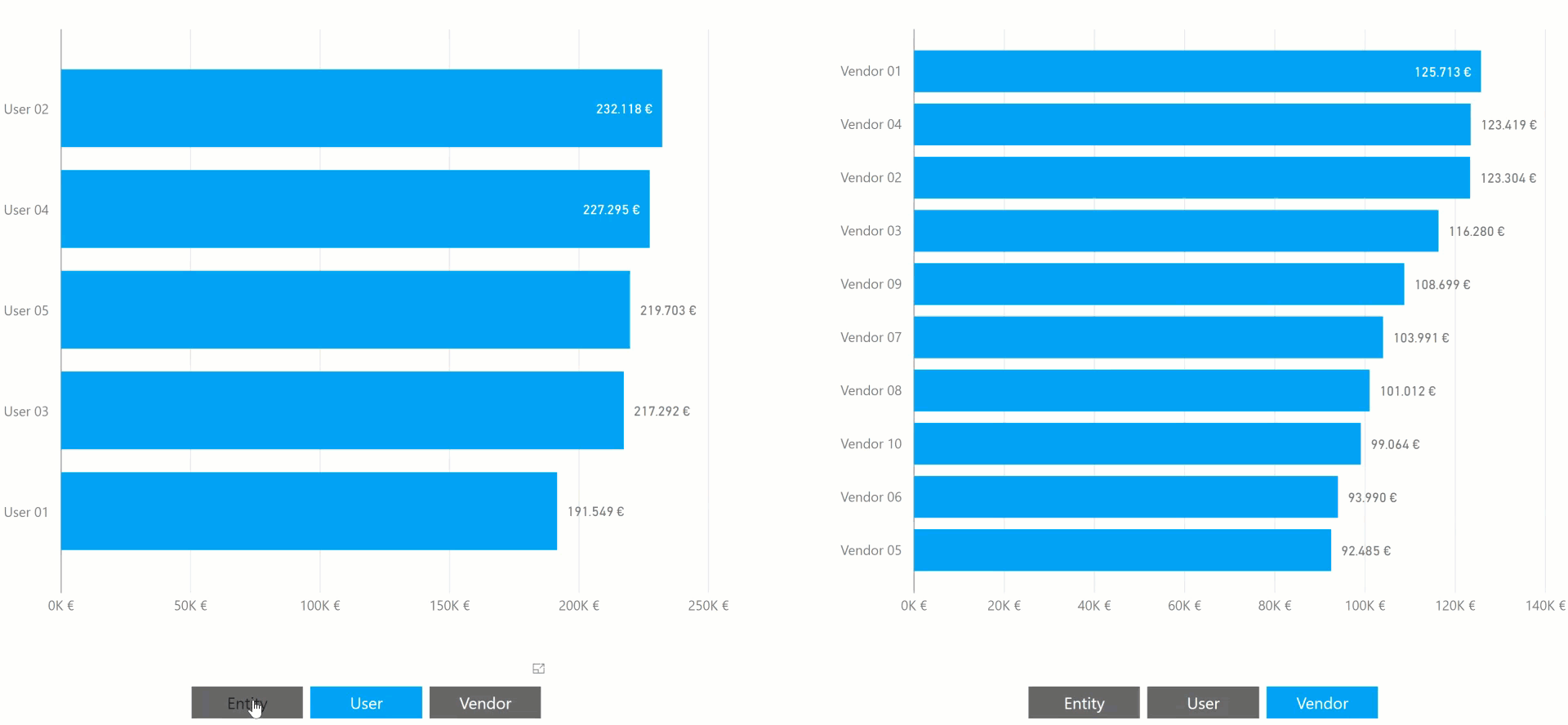
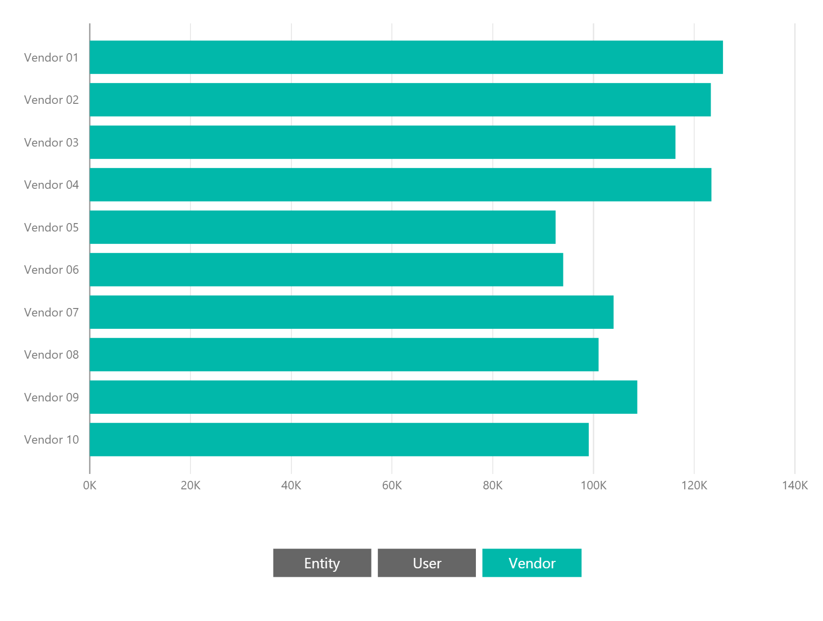
The title was removed from the slicer and bar chart and voila, now we have a beautiful multi-dimensional bar chart.
In the use case for which we had to invent this workaround we needed two bar charts where we could dynamically change the dimension. To achieve this we applied the above steps twice. You create two dimension tables, two join tables and link each join table to the purchases table. Make sure to set cross filter to both directions for all relationships. Below you can find the resulting data model.
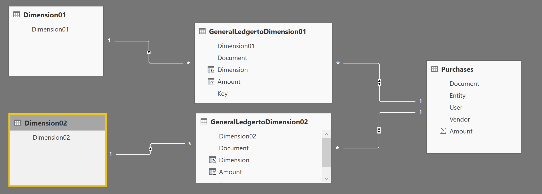
And with some styling applied we now have two charts for which we can switch between dimension and that cross filter when you make selections in a graph.